
CSS3 - Flexbox basics
What is a flexbox?
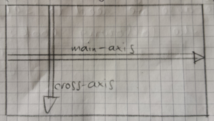
A flexbox is a two-dimensional layout entity. This means elements inside a flexbox, which are called flex-items, will be aligned after two axes: The main-axis and the cross-axis. By default they are aligned like this:
How to make an element a Flexbox
Usually, when you have a list of divs, they will be vertically stacked on top of each other inside their container like so:
See the Pen qRJVmQ by Jan Reinsch (@coded-aesthetics) on CodePen.
By putting the property display:flex on the container they align like this:
See the Pen zNmPEa by Jan Reinsch (@coded-aesthetics) on CodePen.
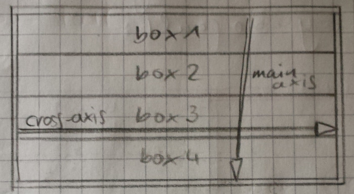
The flex-items are now aligned along the main-axis, which points from left to right by default. Note that the flex-items don’t take up the whole space of the flexbox along the main-axis.
Flex direction
Through the property flex-direction you can change the direction and orientation of the main axis: The default is flex-direction: row.
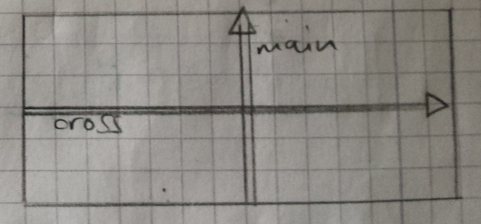
By setting flex-direction:column the alignment of the axes looks like this:
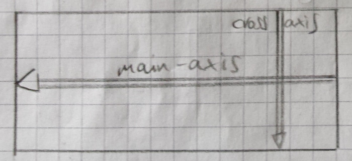
Other options are flex-direction:row-reverse
and flex-direction:column-reverse
which flip the direction of the respective main-axis.
Flex-wrap or welcome to 2D
In the previous paragraphs, flex-items were not aligned two-dimensionally yet. This is because the flex-items did not take up the whole space of the main-axis. So we give each flex-item a width of 100px so they exceed the space of the main axis:
See the Pen XpxVmO by Jan Reinsch (@coded-aesthetics) on CodePen.
But as you can see, the items don’t wrap into the next row. To make this happen you need to set flex-wrap:wrap on the container.
See the Pen VPEyae by Jan Reinsch (@coded-aesthetics) on CodePen.
This also works with flipped axes aka flex-direction:column
See the Pen XpxVdG by Jan Reinsch (@coded-aesthetics) on CodePen.
By setting flex-wrap:wrap-reverse the direction of the cross-axis is reversed, so that it points from right to left:
See the Pen ZLqvpV by Jan Reinsch (@coded-aesthetics) on CodePen.
Reordering of flex-items through flex order
The order of flex-items can be changed by assigning the order property to individual flex-items. By default the order property is 0.
See the Pen NdOXvY by Jan Reinsch (@coded-aesthetics) on CodePen.
The order property is a decimal value like the z-index:
See the Pen vgVppg by Jan Reinsch (@coded-aesthetics) on CodePen.
Flex-items are now ordered according to the value of their order property.