
CSS3 - CSS Grid - Building a responsive grid layout with grid-template-areas
What we’ll be building
In this article, I will describe how to implement an easy responsive page layout with CSS grid.
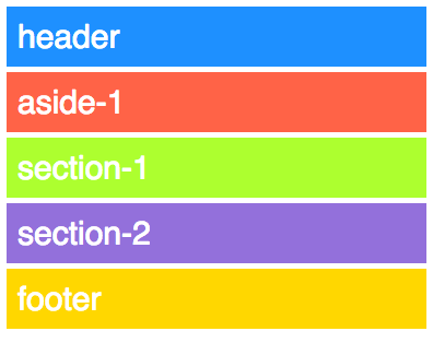
It should look like this when page width is low:
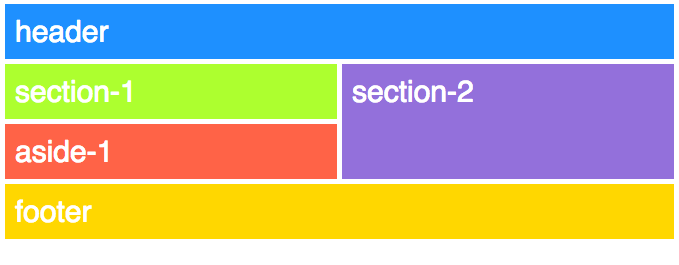
And like this with a high page width:
For this example we’ll be using the grid-template-areas property to layout the grid.
CSS Grid
Defining a CSS grid is done by assiging the display:grid or display:inline-grid property to the container element.
Each of the child elements that are to be layouted then gets a grid-identifier that we’ll use to place them. This is done using the grid-area CSS property.
So, this is the html for our grid:
<div class="container">
  <header class="header-section">
    header
  </header>
  <section class="section-1">
    section-1
  </section>
  <section class="section-2">
    section-2
  </section>
  <aside class="aside-1">
    aside-1
  </aside>
  <footer class="footer-section">
    footer
  </footer>
</div>
Note that these elements are not it the order that can be seen in the layout screenshots above. This is because element order can be set, when defining the grid (just like with flexbox order)
On the css side we give each of the children a unique identifier through grid-area:
.header-section {
  grid-area: header;
}
.section-1 {
  grid-area: section-one;
}
.section-2 {
  grid-area: section-two;
}
.aside-1 {
  grid-area: aside-one;
}
.footer-section {
  grid-area: footer;
}
grid-template-areas
The layout can then be done via the grid-template-areas property:
.container {
  grid-template-areas:
    "header"
    "aside-one"
    "section-one"
    "section-two"
    "footer"
}
This sets a five row, one column layout and leads to this:
For the high width version we define a media query like so:
@media (min-width:600px) {
  .container {
    grid-template-areas:
      "header      header"
      "section-one section-two"
      "aside-one   section-two"
      "footer      footer"
  }
}
This defines a four row, two column layout. Note how section-two spans one column and two rows, and footer and header each span two columns and one row.